

Motivation( 적용해야하는 이유)
Styled components 는 normal CSS코드를 Native Component 가 써도 스타일 적용을 할 수 있게 해준다.
장점 1)

- component의 이름을 이해하기 쉬운 단어로 지정할 수 있다. 즉 , 코드를 읽고 이해하기 쉬워진다.
예를 들면 View , touchableopacity -> Btn
장점 2)
- 쉬운 CSS와 실수 방지
style 적용을 위한 javascript 사용은 CSS코드 작성 방식과 유사하기 때문에 실수를 유발한다.
# styled-components 적용 전
const styles = StyleSheet.create({
  text: {
    flex: 1,
    alignItems: "center",
    justifyContent: "center",
  },
});
# styled-components 적용 후
const Btn = styled.View`
  flex: 1;
  justify-content: center;
  align-items: center;
`;
장점 3)
TouchableOpacity 와 같은 컴포넌트를 일일히 가져올 필요 없다.
import { View, Text, StyleSheet } from "react-native";대신
import styled from "styled-components/native";styled만 가져오면 하나씩 가져와야했던 것들을 함께 사용할 수 있다.

Installation
# with npm
npm install --save styled-components

# with yarn
yarn add styled-components
출처: https://styled-components.com/docs/basics#installation
주의) import 할때 "styled-components/native"에서 가져와야 함.
if use Typescript
Typescript 적용된 react native 프로젝트인 경우, styled-componets를 컴파일하지 못하므로 추가로 해야할 작업이 있다.
출처 : https://styled-components.com/docs/api#typescript
styled-components: API Reference
API Reference of styled-components
styled-components.com
# Web
npm install --save-dev @types/styled-components

# React Native
npm install --save-dev @types/styled-components @types/styled-components-react-native
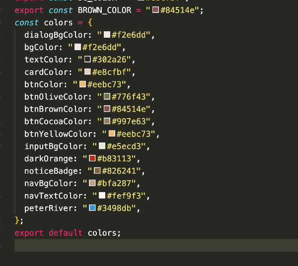
typeScript를 설치하고 확장자를 colors.js -> colors.tsx로 바꾸면 아래와 같이 컬러팔레트도 나타난다.
Creating a declarations file
colors에 있는 프로퍼티를 열람할 수 있게 하기 위해, 프로퍼티 선언?파일을 만들어준다.
https://styled-components.com/docs/api#create-a-declarations-file
styled-components: API Reference
API Reference of styled-components
styled-components.com
1. 최상위 경로에 styled.d.ts를 생성하고 아래 코드를 붙여넣기 해준다.
React-native :
import 'styled-components/native'
declare module 'styled-components/native' {
export interface DefaultTheme {
borderRadius: string;
colors: {
main: string;
secondary: string;
};
}
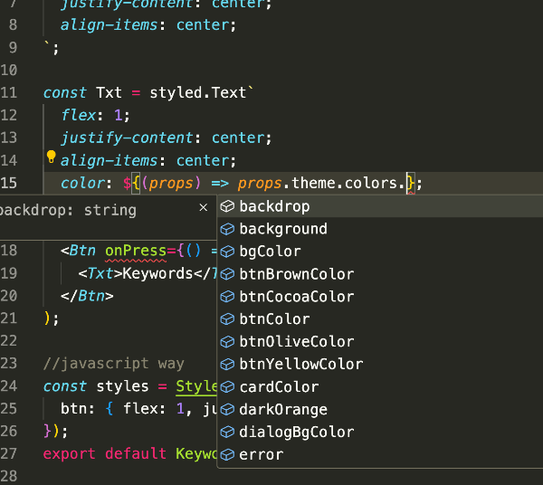
}2. colors 아래에 내 프로젝트의 colors.tsx( 또는 colors.js)파일의 명세를 작성한다.

결과 코드를 작성할 때, colors. 내부의 프로퍼티도 바로 보여줄 수 있게 된다.


댓글